Categories
Uncategorized

Week 5: a Synthesis

  • Respond to the questions raised in the comments and revise your questions in light of those comments.  
  • Include a block of code that reads in data, structures that data, and completes either a chi-square test or a linear regression.
    • If you undertake a chi square test you must:Use a for-loop to simplify a categorical column (i.e. convert towns to a boolean vector of in_cumberland, not_in_cumberland) and use that newly created column in your chi-square test
    • If you undertake a regression analysis you must: merge one or more tables to produce a table that has at least three numerical columns.  Use those numerical columns in your regression analysis.
  • Interpret the results of that regression or chi-square test
  • Explicitly reference at least one reading from this week, and comment on how one (or both) methods discussed in the readings might help your final project.

My original questions regarding the code for the final project had to do with understanding the ledgers from Bates College’s early history, and doing some background digging to understand where that money came from, and what that money was used for. The point of this question was specifically tailored towards Bates’ past vs. Bates’ present, and seeing if what we have access to today on Bates’ campus, was a direct donation made from enslaved labor. Doing this question as a final project requires some design justice elements, as Costanza-Chock puts it, ‘sustaining, healing, and empowering our communities’, ‘centering the voices of those who are directly impacted’, and ‘prioritizing the design’s impact on the community over the intentions of the designer’. With the question centered around Bates and how we envision Bates today in light of its past, it only seems right that the purpose behind the study is to apply more of that history to what we have today, such that things like buildings or houses are not taken for granted or viewed particularly in the same light as they had been previously. History adds to a story, and the histories of specific pieces of Bates would help ground those stories greatly.

In this section, I will use the Chi-Squared Goodness of Fit test to determine whether than is a significant difference between the observed and expected values for donations from towns from Cumberland, and amount of donations made.

cumberland_towns <- c("baldwin", 'bridgton', 'brunswick', 'cape elizabeth', 'casco', 'chebeague island', 'cumberland', 'falmouth', 'freeport', 'frye island', 'gorham', 'gray', 'harpswell', 'harrison', 'long island', 'naples', 'new gloucester', 'north yarmouth', 'portland', 'pownal', 'raymond', 'scarborough', 'sebago', 'south portland', 'standish', 'westbrook', 'windham', 'yarmouth')

donors$is_cumberland <- ''

for (i in 1:nrow(donors)) {
    location_to_check <- donors$Location[i]
    location_test <- location_to_check %in% cumberland_towns
    donors$is_cumberland[i] <- location_test
}

donors$donation_net <- ''
donors$donation_net[donors$Amount <= 1] <- 'Low'
donors$donation_net[donors$Amount <= 5 & donors$Amount > 1] <- 'Medium Low'
donors$donation_net[donors$Amount <= 20 & donors$Amount > 5] <- 'Medium'
donors$donation_net[donors$Amount > 20] <- 'High'

What this code above is doing is it is creating a new vector within the donors table, called is_cumberland. Within another vector, we have added all the towns that reside within Cumberland County in Maine, called cumberland_towns. The for loop below goes through each row of the dataframe, checks the location column, and sees whether that town matches with any of the values in cumberland_towns. Depending on whether this is true or not, the TRUE/FALSE boolean will be put in that index of the is_cumberland vector each time.

A new column called donation_net was also created. This assigned values to each of the donation amounts from each row in the entire dataframe. If a donation amount fell within a certain range, it was assigned with a value of ‘low’, ‘medium low’, ‘medium’, or ‘high’.

We then ran a chi-squared test on the is_cumberland, and donation_net values. In doing this, we are seeing whether donation amounts by county varied by chance, and seeing where there is a correlation between county and amount donated.

chisq.test(donors$is_cumberland, donors$donation_net)

The p-value received from this test was .002825. This means that we can assume that there is a .2% chance that the spread of donations and counties occurred randomly.
Categories
Uncategorized

Week 4: a Synthesis

  • Propose a question that your final project will answer.
  • Describe the data you would require to answer this question. 
  • Describe the ways in which you would structure that data in a relational database. 
  • Describe the methods that you would use to answer your question.

To be honest, I have not exactly thought ‘long and hard’ about what my. final project will be. First and foremost, it should be data that helps to answer a question. I would say that keeping my data and question relevant to today’s times would reflect well on my understanding of current events, and possibly bring greater insight how Bates came to be today. My utmost question for this is, and while it might be generic, I think it would be interesting to know what exactly that money in the ledgers was used for. Were any of those donations used to make Bates what it is today? How might we be able to tell exactly where each of those donations was put?

Being able to answer this question would mean accessing the financial records of Bates College, specifically dating back to the dates listed on the ledgers, with some leeway. Of course, it is unlikely that the money was put to use right away, which is the reasoning behind needing a few more years than the dates the ledgers give. By doing this, we might be able to determine exactly what that donation money was used for, and whether those contributions still stand today.

In terms of structuring this data, it would be useful to organize the data so that a visualization can be made that shows whether money went into buildings, the hiring of professors, or even into the land; in order to acquire more academic space for students at Bates. It would be curious to see exactly what we have today that could have been built by slavery, especially after knowing that the founding of Bates was built upon it.

The methods that I would use to answer this question would be to collect the data from the Bates College archives; specifically data regarding the ledgers of donations in the early years of the college, as well as spending records – ledgers that denote exactly what money the College was using. In this sense, it would be more appropriate to look at all of the spending of the college, in order to specifically note what money was being used and when, especially in the grand scheme of Bates’ spending. I would then use R to compile and clean the data, sorted into .csv files, then use R to create visualizations of this data in order to understand it better. I was thinking something more along the lines of pie charts, heat maps, and scatterplots, in order to visualize the flow of money both coming in and going out. Doing these types of vizes side by side would be especially helpful.

Those were just my adjusted ideas on what I could potentially do for a final project.

Categories
Uncategorized

Week 3: a Synthesis

  • Synthesis #3: Write a wordpress post of about 500 words reflecting on your learning for the week.  Your post should:
    • Comment on things you learned this week
    • Comment on things that changed your perspective on something you already knew.  
    • Include a scatterplot that visualizes the relationship between the amount of money donated and the day of the month and the code that you used to produce it, commented so that another person who works with R could understand it.
    • Include a calculation of correlation of the relationship between the amount of money donated and the day of the month and the code that you used to produce it, commented so that another person who works with R could understand it.
    • Reflect on what the scatterplot and calculation of correlation tells us (if anything).
    • Discuss other numerical attributes that you would be interested in plotting with regards to the Maine State Seminary data.
    • Explain how we should think about the Maine State Seminary data in light of the Fuentes reading.

This week was rather interesting. To me, it was not so much learning new material as it was reviewing materials I’ve learned in the past. This sounds cocky, but for our final project last year, much of it entailed looking at datasets, namely CSV files and analyzing the data in them using scatterplots, heat maps, bar charts, and organizing and parsing the data in different ways. The one thing that was quite difficult this week was the converting the handwritten text and numbers into the CSV file.

I think that it goes without saying that the translation aspect of this week might have been the most difficult portion of the material. While I’m not sure it necessarily counts as material, it was still a piece of this week’s work that I found surprisingly difficult. It showed me that what I previously thought was pretty easy is actually really not the case.

Within our partner code worksheet this week, we were able to successfully compile a CSV file and run code based off of that. Some of the code wouldn’t run at first, most likely because of the way that we compiled the code.

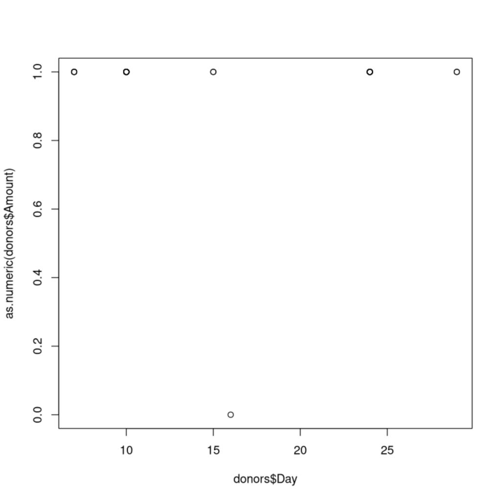
We were able to run a scatterplot that visualized the relationship between the days of the months that people donated to Bates, and the donation amounts from those people. Below is an example of the code we used to compile this:

donors$Amount <- !is.na(donors$Amount)
#because of the NA value added because of the organization donation, 
#we had to remove it using the is.na() function.
#the variable created above is every row except for the row that 
#previously held the NA

First we had to convert the Amount column to an ‘as.numeric’ model, given that the decimal values in that column had previously made the column characterized and therefore it would not run in a scatterplot or correlation. Changing to ‘as.numeric’ would allow us to complete these tasks.

plot(donors$Day, as.numeric(donors$Amount))
#this plot takes the column Day from Donors and uses it as the X variable, 
#and takes the Amount column from Donors, and makes it numerical
#in the sense that every number is common (no decimals, etc), and uses that as the Y
#We can see there is no real correlation in the data. 

The plot() function here is the code used to create the scatterplot. By listing donors$Day first, we are naming that as the X axis, and donors$Amount to the Y axis. This code above therefore plots the scatterplot seen below:

We also had to determine a correlation for this data, running the code in cor() using the same format as the scatterplot code:

cor(donors$Day, donors$Amount)
#Uses donors$Day as the x, and donors$Amount as the Y to find the 
#correlation between the day of the month, and the amount of money donated. 

This code outputs the number -.0138, which means that our data had a slightly negative, but basically 0 correlation, meaning that the date was not a tell-tale sign of whether people would donate, or how much they would donate if they did.

With regards to the Maine State Seminary data, it would also be interesting in plotting student populations and donations. What did these donations go towards? Is there a correlation between donations and student population? How might these donations have influenced student attendance at the school?

With regards to the Fuentes reading, and in light of archival power, we might be able to assume that perhaps the data being left out here would be how the donations were acquired by those providing them. Were they acquired through clear consciences? Perhaps a little more data in this realm would help us fully understand the breadth of wealth that was given to Bates during the founding years.

Categories
Uncategorized

Week 2: a Synthesis

  • Synthesis # 2:  Write a wordpress post of about 500 words reflecting on your learning for the week.  Your post should:
    • Comment on things you learned this week
    • Comment on things that changed your perspective on something you already knew.  
    • Include commented code that another person who works with R could understand
    • Include an histogram
    • Reflect on what the histogram tells us
    • Interpret the histogram in light of theory.  
    • Explicitly reference at least one reading from this week.

This week took on more historical learning than code-based learning. It began with learning about indexing and subsetting, with the focus being on lists created using invoices from Benjamin Bates’ cotton industry. We would compile lists in R of the various weights of the bales of cotton transported to Bates, and then implement what we learned from outside of class videos to that data.

We also completed a worksheet during this week, one that focused on specific invoice data from the Bates Cotton Manufacturing Company, using that data to make a list of the bale weights for the cotton, and looking at statistical aspects of that data. We were able to find approximate costs for the total amount of money the cotton was worth/sold for, as well as the approximate number of days it took to compile the invoice amount of cotton that was provided.

bale_weights <- c(518, 530, 470, 503, 538, 518, 443, 478, 458, 463, 468, 501, 483, 543, 508, 493, 468, 523, 464, 468, 428, 443, 503, 543, 516, 503, 583, 470, 453, 463, 490, 468, 548, 508, 513, 478, 500, 508, 493, 473, 501, 549, 487, 508, 454, 448, 453, 498, 458, 443)
#Creates a vector that contains the weights of each bale of cotton contained in the invoice. 
bale_days <- bale_weights/150
sum(bale_days)
#creates a variable bale_days to determine the number of days of labor all bales of cotton
#from the invoice took
bale_money <-bale_weights*.1075
sum(bale_money)
#creates bale_money that uses the bale_weights vector to find the total amount of money the shipment
#was

We also were able to make a histogram containing the varying weights of the bales of cotton. Within this graph we were able to see the ranges in weight that the cotton bales were the most likely to be.

hist(bale_weights)
#creates a histogram of the amounts of weight that the bales of cotton were, and organizes it 
#in histogram format
Figure 1. This histogram presents weights on the X axis and the frequencies at which they occurred on the Y axis. You can see here that many of the bales of cotton tended to fall between 450 and 500 pounds of cotton.

Further this week, we were also able to learn more about the language the role of feminism in data science, as well as a concept called racial capitalism. Learning that a racial aspect lies within many forms of capitalism changed my views of money, specifically in how money is made and how many businesses and organizations thrive off of the forced labor of others. In his talk at the University of Washington, Robin Kelley referenced racial capitalism as being “the ways that money is earned, at the expense of violence, racism, imperialism, and genocide”. In a way, this explains the ‘sweat shops’ that run around the world today, and many other now-archaic business practices that took advantage of the needs of those who could not survive without some form of labor/pay.

We also read a paper on data feminism, specifically referencing how data science should not be a male-dominated conversation. It spoke in great length about how women’s accomplishments in the science fields have gone greatly undernoticed, and thus those who experience success are not allowed to celebrate it. The goal of data feminism is to convince people that data science remains a relevant topic to members of all genders, not necessarily males.

As of late, I feel as though there were many learning opportunities from various angles to take advantage of this week. Each article we read is a different look on data science, specifically leaning on topics like feminism, racial aspects, and the language components. I look forward to what is to come.

Categories
Uncategorized

Week 1: a Synthesis


  • Synthesis # 1: Write a WordPress post of about 500 words reflecting on your learning this week.  Your post should: 
    • Comment on things you knew before coming into the course
    • Comment on things you learned this week
    • Comment on things that changed your perspective on something you already knew.

Week 1 has come and gone, and with it has arrived the beginning of a new semester and a new DCS experience.

After skimming the syllabus and asking questions related to course materials and the general influx of the module, it was right down to business taking notes and learning (or reviewing) the very basics of the computing language R.

From a purely coding perspective, R is a language that I find myself familiar with. The past few DCS classes that I have been a part of have all utilized R in different ways, whether it be synthesizing data for projects or presentations or using it to create visualizations from already existing data. My point is, is that I have used R for a multitude of different functions – all circulating around data analysis of some sort. Going back to the basics here was refreshing for me and I have no doubt that this reversion back to the bare bones of R will allow me to intensify my learning and understanding of R in a way that I haven’t been able to before from a perspective that I haven’t been able to take advantage of yet.

By starting from the basics, I was able to retrace my steps and reacclimatize myself with the basic functions of R – whether it be learning how to effectively comment on cells of code or the primary structures for printing text using code.

We also did a fair bit of reading and note taking for this course, beginning with the ways in which a person can effectively read large bodies of text and understand them to the fullest extent. Learning alternative ways to read and note take on texts that seem daunting is a valuable skill that I always seemed to have missed out on growing up – primarily speaking, I am not or have not been the greatest note taker. Hopefully, my notes for this class will improve not only from a general perspective but also in terms of my comprehension of the materials.

One of the pieces of work we also focused on this week was the history of Bates College and the misconceptions current students, faculty, alumni, and prospective students and families seem to have regarding it. I remember Joe Hall during Commencement 2018 speaking about the history of the college and the pieces of that story that are frequently left out of the tales of the origins of Bates. Being a tour guide, I tried my best to ensure that I incorporated those historical aspects into my tours, although now I can recall glossing over them in the beginning before placing a larger emphasis on the current Bates community ~ after all, while history is important, isn’t the present community and academics the reasons that students and families choose Bates?

And thus effectively concludes my first weekly synthesis of the 2020-2021 school year. I am very excited about what is to come and I look forward to the experiences and the learning that is to happen this module.

css.php