- Synthesis #3: Write a wordpress post of about 500 words reflecting on your learning for the week. Your post should:
- Comment on things you learned this week
- Comment on things that changed your perspective on something you already knew.
- Include a scatterplot that visualizes the relationship between the amount of money donated and the day of the month and the code that you used to produce it, commented so that another person who works with R could understand it.
- Include a calculation of correlation of the relationship between the amount of money donated and the day of the month and the code that you used to produce it, commented so that another person who works with R could understand it.
- Reflect on what the scatterplot and calculation of correlation tells us (if anything).
- Discuss other numerical attributes that you would be interested in plotting with regards to the Maine State Seminary data.
- Explain how we should think about the Maine State Seminary data in light of the Fuentes reading.
This week was rather interesting. To me, it was not so much learning new material as it was reviewing materials I’ve learned in the past. This sounds cocky, but for our final project last year, much of it entailed looking at datasets, namely CSV files and analyzing the data in them using scatterplots, heat maps, bar charts, and organizing and parsing the data in different ways. The one thing that was quite difficult this week was the converting the handwritten text and numbers into the CSV file.
I think that it goes without saying that the translation aspect of this week might have been the most difficult portion of the material. While I’m not sure it necessarily counts as material, it was still a piece of this week’s work that I found surprisingly difficult. It showed me that what I previously thought was pretty easy is actually really not the case.
Within our partner code worksheet this week, we were able to successfully compile a CSV file and run code based off of that. Some of the code wouldn’t run at first, most likely because of the way that we compiled the code.
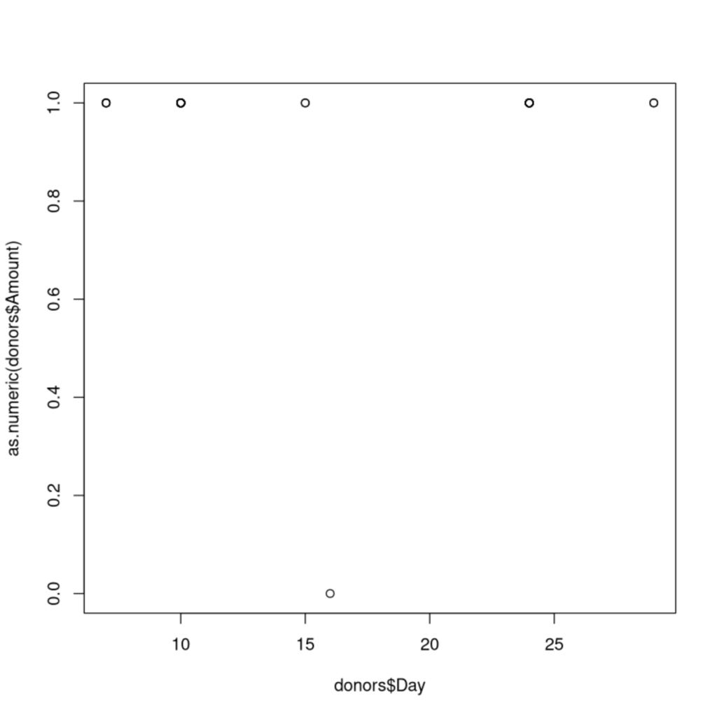
We were able to run a scatterplot that visualized the relationship between the days of the months that people donated to Bates, and the donation amounts from those people. Below is an example of the code we used to compile this:
donors$Amount <- !is.na(donors$Amount)
#because of the NA value added because of the organization donation,
#we had to remove it using the is.na() function.
#the variable created above is every row except for the row that
#previously held the NA
First we had to convert the Amount column to an ‘as.numeric’ model, given that the decimal values in that column had previously made the column characterized and therefore it would not run in a scatterplot or correlation. Changing to ‘as.numeric’ would allow us to complete these tasks.
plot(donors$Day, as.numeric(donors$Amount))
#this plot takes the column Day from Donors and uses it as the X variable,
#and takes the Amount column from Donors, and makes it numerical
#in the sense that every number is common (no decimals, etc), and uses that as the Y
#We can see there is no real correlation in the data.
The plot() function here is the code used to create the scatterplot. By listing donors$Day first, we are naming that as the X axis, and donors$Amount to the Y axis. This code above therefore plots the scatterplot seen below:
We also had to determine a correlation for this data, running the code in cor() using the same format as the scatterplot code:
cor(donors$Day, donors$Amount)
#Uses donors$Day as the x, and donors$Amount as the Y to find the
#correlation between the day of the month, and the amount of money donated.
This code outputs the number -.0138, which means that our data had a slightly negative, but basically 0 correlation, meaning that the date was not a tell-tale sign of whether people would donate, or how much they would donate if they did.
With regards to the Maine State Seminary data, it would also be interesting in plotting student populations and donations. What did these donations go towards? Is there a correlation between donations and student population? How might these donations have influenced student attendance at the school?
With regards to the Fuentes reading, and in light of archival power, we might be able to assume that perhaps the data being left out here would be how the donations were acquired by those providing them. Were they acquired through clear consciences? Perhaps a little more data in this realm would help us fully understand the breadth of wealth that was given to Bates during the founding years.